
The New York Times’ presidential election forecast is comprehensive, complex, and captivating. But it’s also giving obsessive viewers heart palpitations with the jittery needles on its forecast dials, wavering between percentage chances in a way that seems to indicate an incoming flow of accurate data, but that is in reality entirely artificial.
The fluctuations are actually built into the site, a fact spotted by writer and analyst Alp Toker. Rather than representing minute changes in percentage chances as election data streams in, Toker shows that the NYT’s forecast has hardcoded jitter on its election coverage page, code that causes the needles to flutter as wildly as our collective hearts are watching the results come in. Lauren Ancona, a data scientist, also explained the situation, arguing that the quivering dials “border on irresponsible data visualization.”
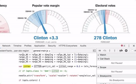

The NYT’s Gregor Aisch responded to Toker’s tweet, saying that the “noise is conveying the uncertainty in our forecast,” and specifying that the movement ranged from the 25th to the 75th percentile in simulations. But as other commenters pointed out, the precision of a dial was perhaps not the best way to represent this uncertainty, especially not when early election data proved too close to call. Perhaps a wider, non-jittery needle would have sufficed, or an indication that the number it was pointing to was projected to be a range, instead of the endlessly wavering version we got.
Looking for trends in @nytimes's presidential forecast needle? Don't look too hard - the bounce is random jitter from your PC, not live data pic.twitter.com/pwcV6epee7

No comments:
Post a Comment